Cedar Valley Unitarian Universalists
Brief
Cedar Valley Unitarian Universalists (CVUU) required a comprehensive rebranding initiative to align with their new name. The cornerstone of the new brand identity will be a Unitarian Universalist (UU) chalice, reimagined with organic elements and incorporated into a calming color palette.
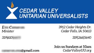
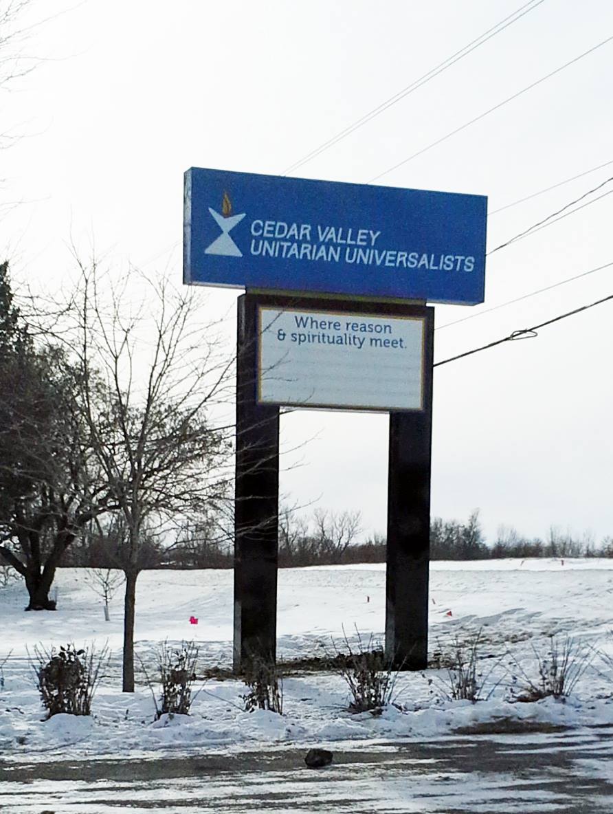
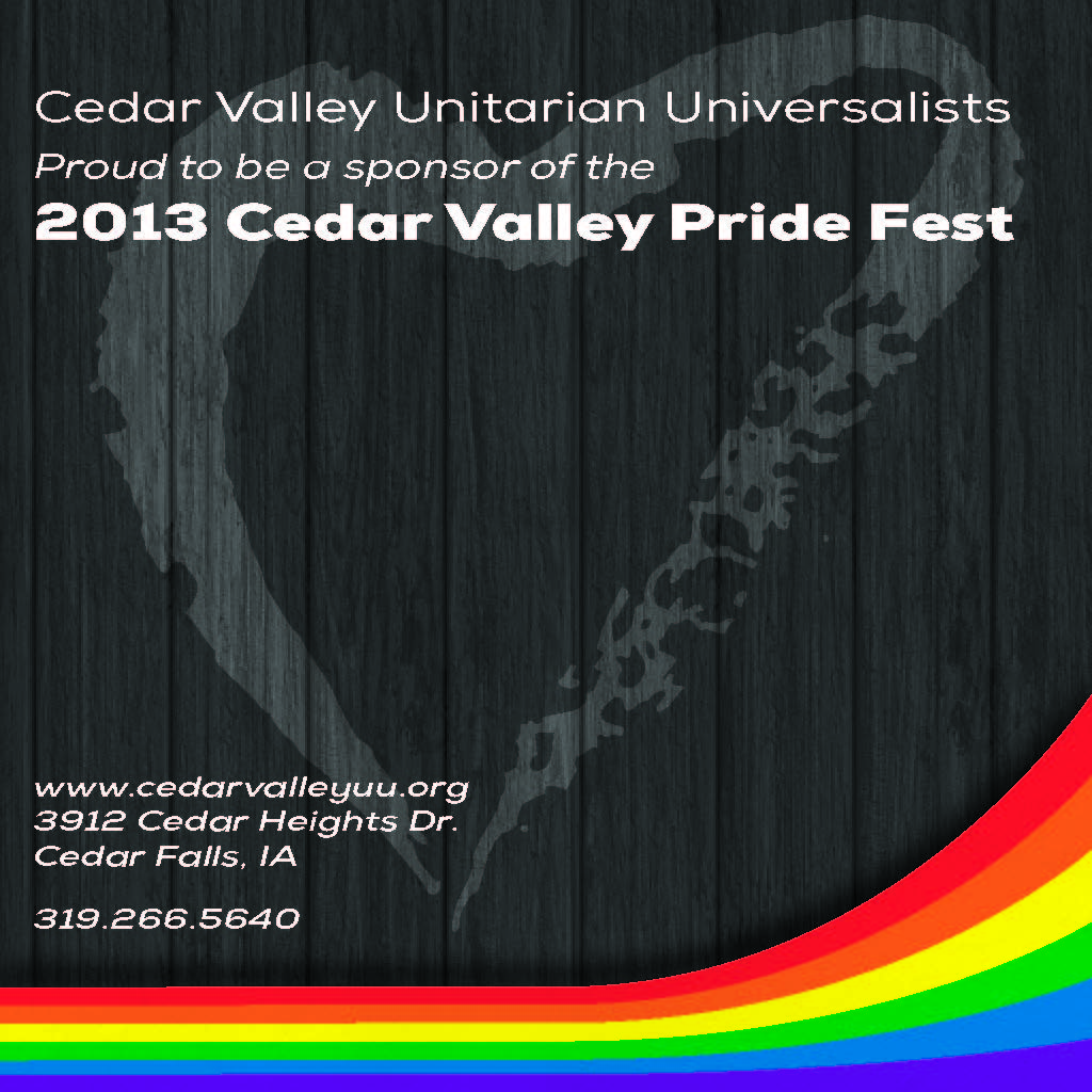
Beyond the traditional brand package, the project scope includes the design of various collateral materials for the church’s operational and promotional needs. This encompasses items such as orders of service, certificates, advertisements, merchandise, and signage, all bearing the newly established brand aesthetic.
Designers Statement
The design process was iterative. While the client initially expressed interest in a natural, water-inspired logo, they ultimately gravitated towards a more industrial aesthetic. This shift aligned with their preference for a specific typeface used in a previous design concept. Through live sketching during a meeting, we collaboratively developed a logo that successfully captured the desired feel that complemented the chosen typography.