British Airways
Graphic Designer – Branding Practice
Brief
British Airways sought to shed its “overly stuffy” British image in the 1997 rebrand. However, with the modern shift in consumer preferences towards mainline carriers, the airline now aims to reclaim a sense of sophistication while staying modern. This rebranding project balances the airline’s rich heritage with contemporary sensibilities. By preserving elements of the iconic Speedmarque, the new identity honours the brand’s history while positioning British Airways as a premier choice for discerning travellers.
Designers Statement
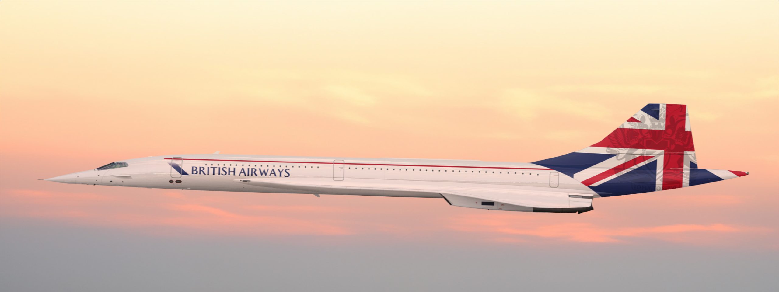
Drawing inspiration from British Airways’ rich history, we’ve reimagined the brand identity. The iconic Speedwing design from the 80s-90s Landor logo has been revitalised with elements of the Speedmarque, resulting in a modern interpretation that respects the brand’s heritage. The existing colour palette has been harmonised with the Union Jack flag, creating a fresh and patriotic aesthetic.
To further deepen the brand’s connection to its roots, we’ve incorporated elements from British European Airways (BEA), British Caledonian (BC), and British Overseas Airways Corporation (BOAC). A stylized Union Jack is now prominently featured on the tail, a nod to BEA. BOAC’s Speedbird icon represents the pinnacle of luxury in our first class lounges. The BC crown symbolises exclusivity and rewards within the Executive Club.
Complementing the British Airways rebrand, OneWorld, the airline alliance, has also received a subtle update. The primary purple has been deepened to a sophisticated “Global Blue,” and a contrasting “Unity Purple” has been introduced. The globe icon has been refined to accurately reflect our global reach, and other colours have been adjusted for optimal harmony. This cohesive approach strengthens the OneWorld brand identity and reinforces its alignment with British Airways.